Blog
Welcome

Recent posts
SEARCH RESULTS FOR: Featured Portrait Album

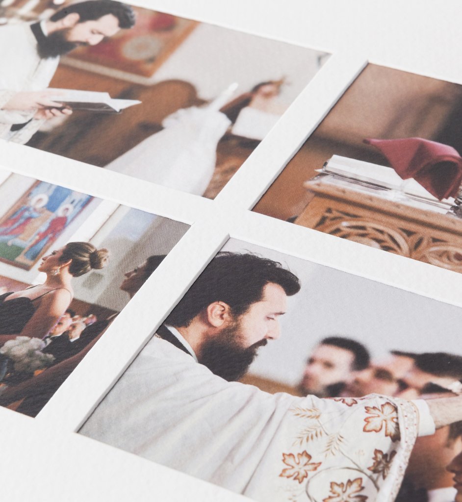
Pagemount vs Overlay We offer a few types of matted album — Overlay Matted, Duo and Musée —and one of the important differences between them is whether the prints are mounted Overlay or Pagemount style. So what's the difference? Overlay: Industry-wide, almost all matted albums are overlay mounted, so overlays may not be new to you. Details may vary from manufacturer to manufacturer, but the photographs are attached behind the mat, which covers and conceals the edge of the prints. You can see this clearly in the first photograph. To View More >>

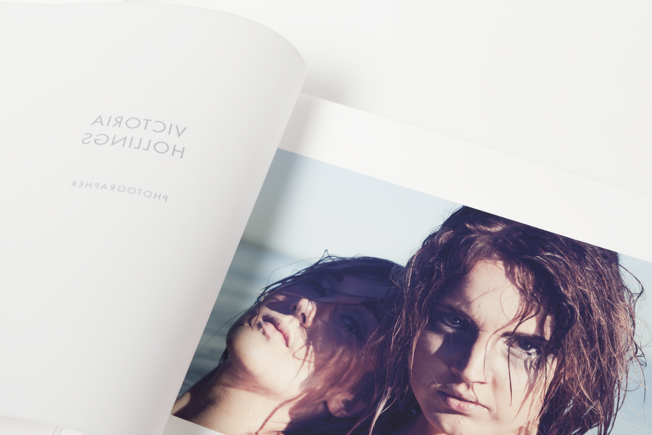
Online galleries are a great way to display your portfolio, but printed portfolios have way more impact . And here's something different again – a "portfolio album". Such an impressive calling card! This particular portfolio is a 10x10 Panorama Flushmount with Fine Art printing — a high-end choice. Panoramas are perfect for big, bold imagery. You can spread a single photograph across a double page spread for major impact — creased, not cut, at the spine. Q-Books (medium and light) are affordable alternatives. Portrait To View More >>
Is this the ideal way to present your portrait photography? Your clients will love our hand made boxes, designed to keep their favourite images looking their beautiful best for years to come. They’re designed to be enjoyed too — whether for sharing with friends and family, or for quiet reflection in an overloaded world. And of course they’re a great silent salesman for you. Our Q boxes can hold up to 25 prints in 10x8 or 14x11 mats (25x20 or 45x28cm). The feature you may like best? We do the work, not you! Just upload your images and in two weeks we’ll deliver To View More >>

A personal website for your clients, with your photography, your client's album design, a gift registry, a guest book, a link to your own site… oh, and a shopping cart! In just a few minutes you can create a beautiful-looking site that your clients will find appealing and useful, that provides a convenient way to interact with them about their album, and that helps spread the word about you, while encouraging some nice add-on sales from friends and family. Workspace has three new and improved designs that reflect our web themes, are mobile responsive, and are just as easy To View More >>

Last week we were enjoying drinks and nibbles with some photographers in the Design Space, and they asked, why all the pictures on the walls? The short answer: We’re visual people and we need visual prompts. The long answer: It’s part of our design process. We fill walls with things that inspire us, projects we’re working on and ideas for the future. They remind us what we’re up to and where we’re going. Workspace has been our main focus as designers this year. We’re a small team, and it seemed a daunting task. “Where do we start?” we To View More >>


Email: info@queensberry.com
Free Phone Numbers:
New Zealand: 0800 905 905
Australia: 1800 146 251
USA: +18668350851
UK: 0800 808 5271
Canada: +1 855 581 0370